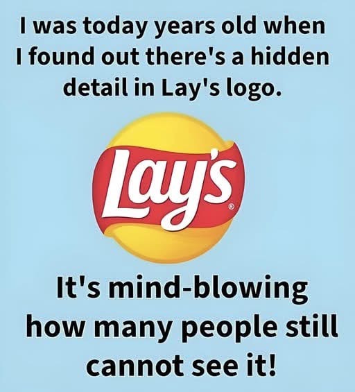
Look closely at the Lay’s logo and you will notice something strangely familiar. That red ribbon shape sweeping across the center is not just a decorative flourish meant to grab attention on a crowded shelf. It mirrors the flowing banner from the old Frito Lay logo, carrying the same gentle curve, the same sense of motion, and the same welcoming personality. Even if most shoppers could not consciously point it out, the shape feels known. It signals continuity, warmth, and trust before a single word is read.
The yellow circle behind the ribbon works on a similar level. On the surface, it suggests the obvious. A golden potato chip. A warm, appetizing glow. Look deeper, and it also echoes the soft, rounded forms that defined Frito Lay’s visual identity for decades. Circles and curves dominated the company’s early branding, chosen to feel friendly and accessible rather than sharp or corporate. The Lay’s logo carries that language forward, quietly borrowing from its roots to reinforce a sense of familiarity that feels earned rather than forced.
This kind of design choice is never accidental. It is also not a case of lazy reuse or nostalgia for its own sake. It is a deliberate visual bridge between the individual product and the larger company behind it. Lay’s rarely needs to lean on the full Frito Lay name to prove its credibility. Instead, it embeds that heritage directly into the design, allowing long time recognition to do the work. The logo speaks to the past without stopping the brand from feeling current.
Herman Lay began selling potato chips in 1932, working from a small operation with limited reach and simple packaging. As the company grew and later merged into what became Frito Lay, its branding evolved to match its scale. What stayed consistent was the emphasis on approachability. Snack food is emotional. It is tied to comfort, routine, and small moments of pleasure. The branding needed to feel like an invitation, not a barrier. Rounded shapes, flowing ribbons, and warm colors all support that goal.
Leave a Reply